Advoteck: Designing a Typesafe Mobile Keyboard for Vulnerable Users
Industry
Keyboard Technology
Client
Advoteck
Service
UI/UX Design
Date
August 2024
Project Overview
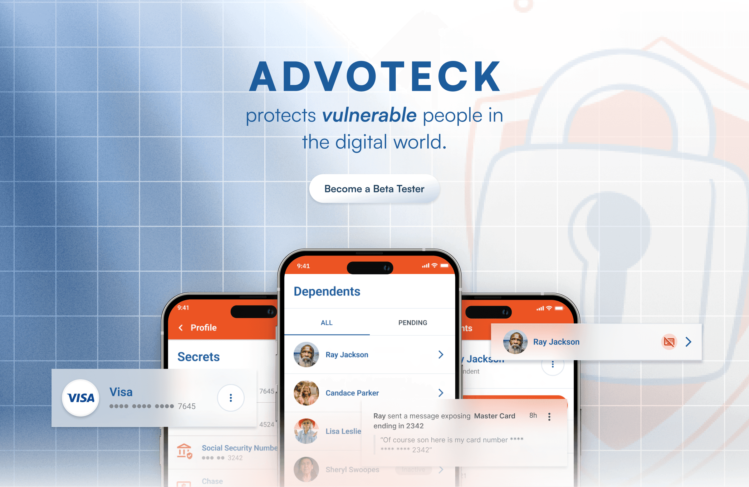
Advoteck approached us with a bold goal: design a mobile experience that quietly protects vulnerable users from digital harm—without eroding their independence. As Lead Product Designer, I was responsible for translating an emotionally charged mission into a clear, accessible, and technically feasible solution from the ground up.
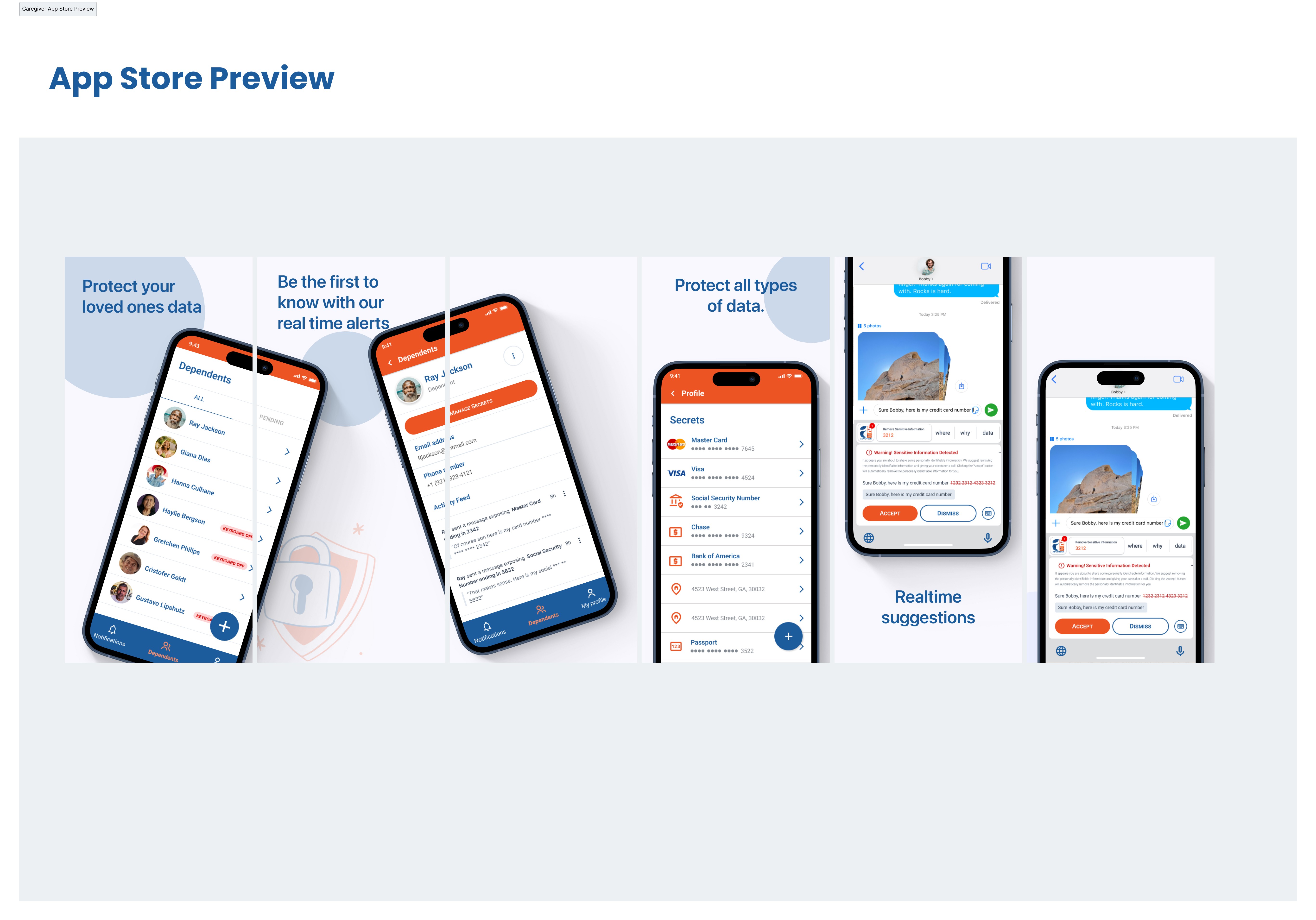
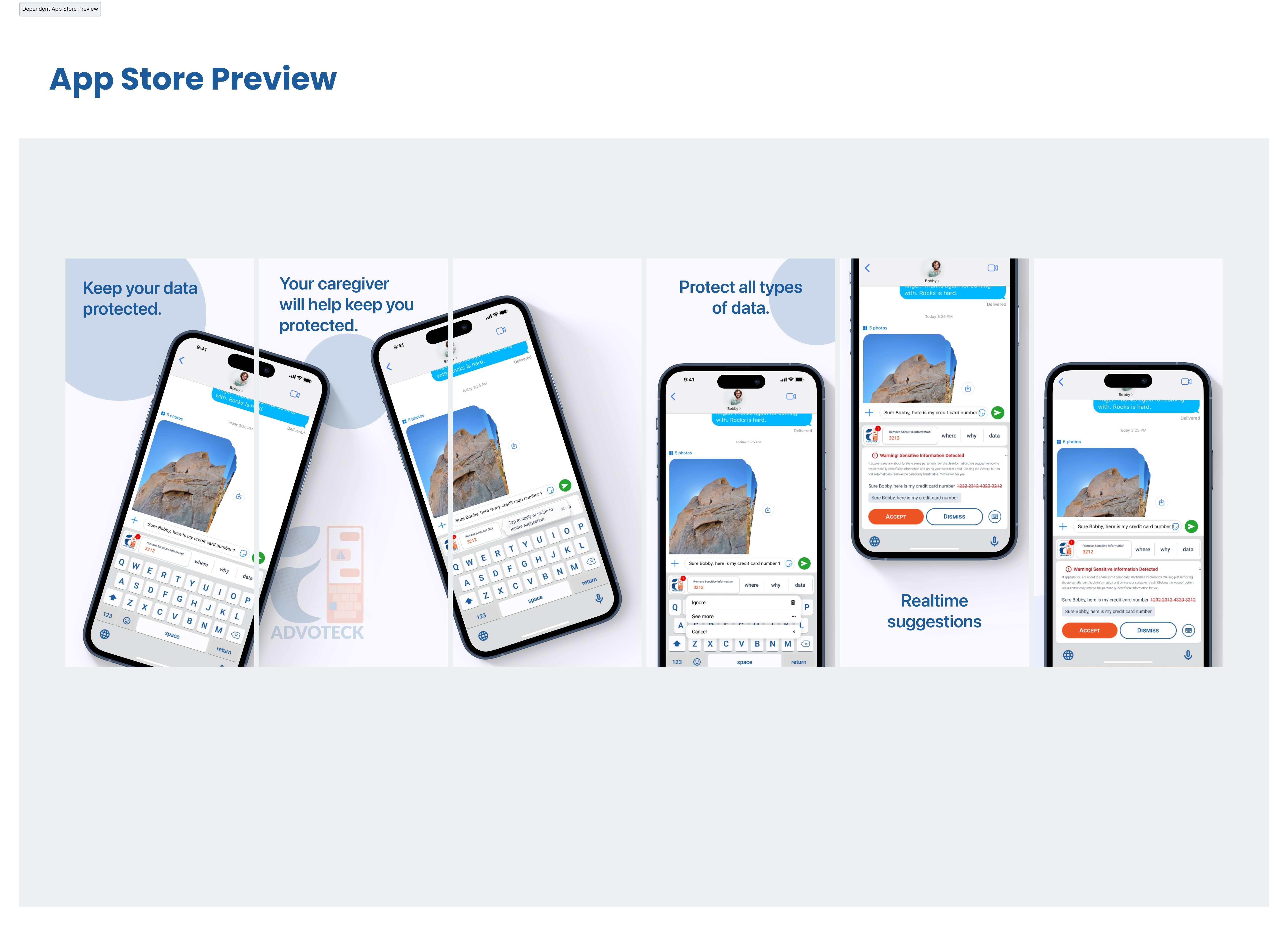
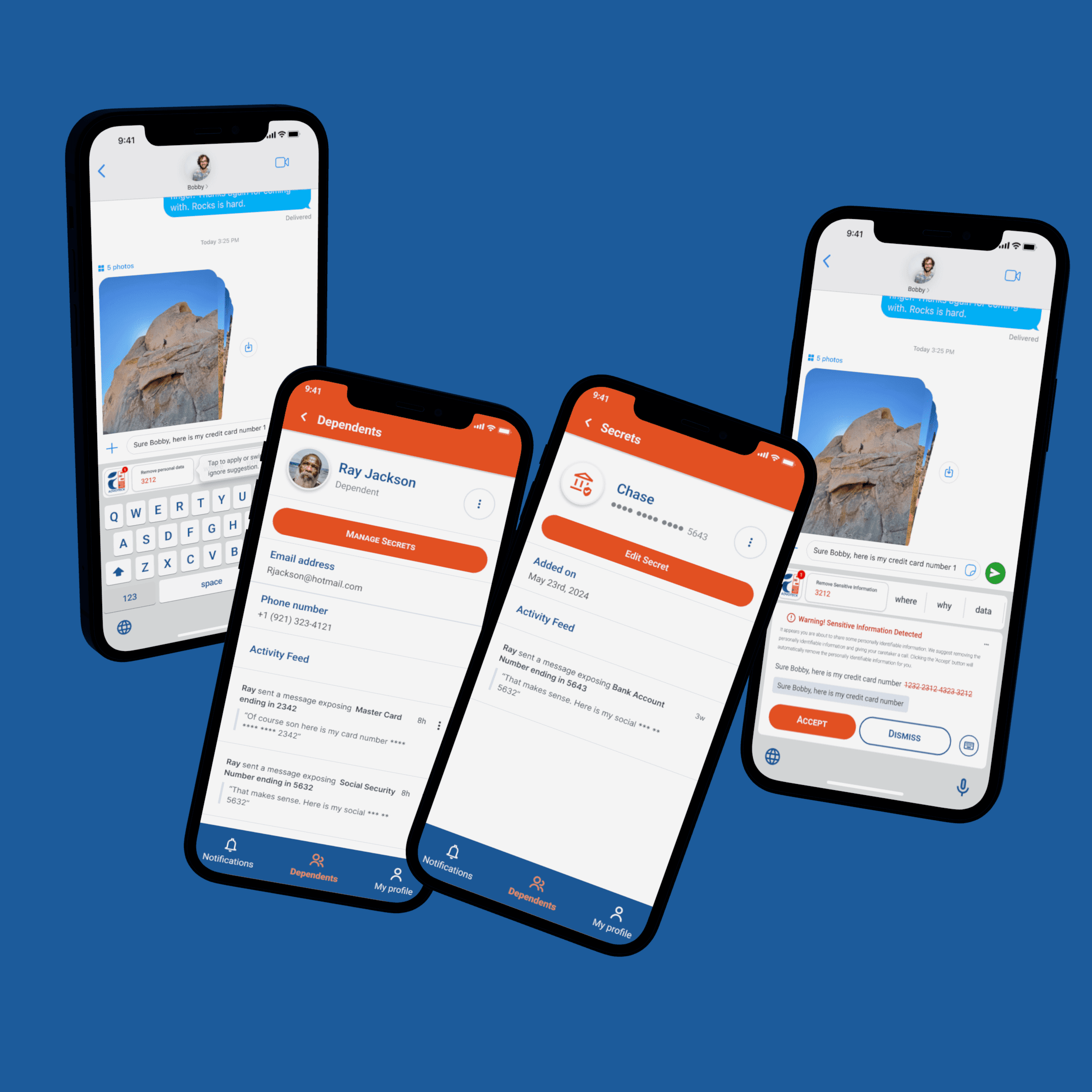
The solution: a typesafe keyboard that detects when a user types something sensitive (like a Social Security number, address, or credit card), then notifies a caregiver while also offering real-time, educational suggestions to the user.
As the sole designer, I led the product design from research through launch, ensuring the product was safe, accessible, and empathetic.
The Problem
Vulnerable users—those with cognitive disabilities, aging-related tech challenges, or adolescent impulsivity—are especially prone to digital exploitation. From phishing attempts to accidental data sharing, they face online threats with few tools designed specifically for their needs.
Caregivers, on the other hand, often find themselves reactive rather than proactive—learning about breaches only after damage has occurred.
There were no real-time systems in place to:
Detect sensitive data as it’s being typed
Alert a caregiver before harm occurs
Educate users gently instead of restricting them
How I Got Involved
Advoteck found us through my tech partner at Tuck Software Group, who was offering fractional CTO services. The client had early designs and thought they were development-ready — but our team knew better.
Their urgency stemmed from a real event: one of the founders had a special needs sister who had fallen victim to online scams. This wasn’t just a project — it was personal.
Understanding the Users
We had two main personas:
1. Vulnerable Users
Included special needs individuals, tech-novice seniors, and teens
Primarily used social media where they were most at risk
Desired freedom and normalcy, but lacked the digital literacy to spot scams
2. Caregivers
Often overwhelmed, juggling many responsibilities
Needed a low-maintenance, trustworthy tool to help protect loved ones
Wanted visibility, not control — support, not surveillance
Research Process & Key Insights
I began with semi-structured interviews (via Zoom and in-person) with:
Caregivers
Tech-aware seniors
Digital safety advocates
I followed with moderated usability testing of early wireframes and quick surveys for impressions on clarity and usefulness.
Major Insights:
Trust was paramount: Caregivers needed to trust the product and its creators.
Cognitive load matters: Too many toggles or unclear icons caused stress and hesitation.
Feedback preferences vary: Some users wanted detailed alerts, others preferred minimal interruptions.
These insights shaped every layer of the product — from microcopy to visual structure to notification logic.
High-Level Process
1. Clarified the Problem with Journey Mapping
Mapped parallel journeys for:
The vulnerable user typing sensitive info
The caregiver monitoring alerts
This exposed moments of friction, trust gaps, and emotional decisions.
2. Defined the System Architecture
Established four core components:
A typesafe keyboard
A caregiver management app
Real-time alerts
Transparent onboarding
3. Designed the Keyboard to Be Subtle Yet Protective
Gentle inline nudges for flagged content
Passive monitoring with adjustable sensitivity
Educational messaging instead of hard blocking
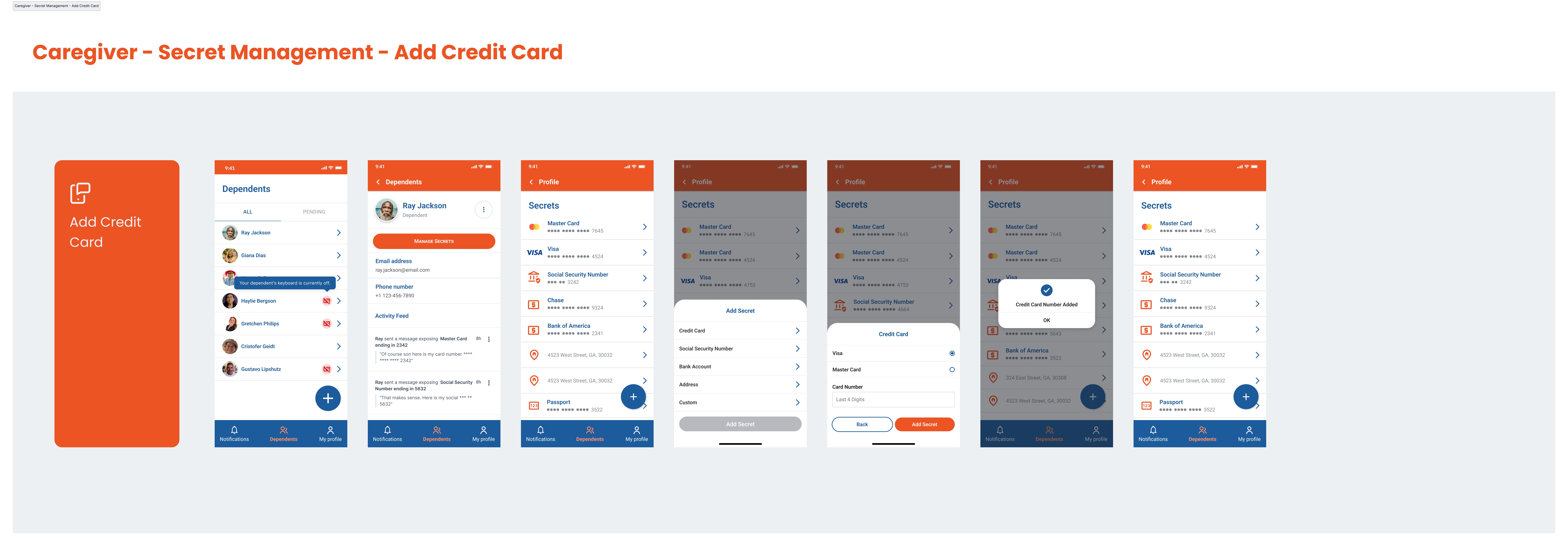
4. Built the Caregiver Dashboard for Confidence, Not Control
Setup for “secrets” like SSNs or card numbers
Real-time notification system
Sensitivity settings for each user
5. Mapped an Alert & Escalation System
Different severities trigger different actions:
Logged silently
Alert caregiver
Trigger intervention
Designed fallbacks for false positives and user error.
6. Created a Trust-Centered Onboarding Flow
Explained what the keyboard does and doesn’t do
Clarified privacy and user control
Used warm, plain language and “Why we ask this” tooltips
7. Prioritized Accessibility Early
Tested for cognitive load during risky input events
Used high-contrast color modes and dyslexia-friendly fonts
Designed for fat thumbs, shaky hands, and emotional stress
8. Applied a Calm, Trustworthy Visual Style
Neutral palette (think soft blues/greys)
Rounded elements and soft shadows
Clean typography and gentle animations
We weren’t designing a warning system — we were designing a quiet guide.
Outcomes & Impact
Advoteck launched successfully on iOS and Android, with a thoughtful mix of protection and empowerment. Caregivers got peace of mind. Vulnerable users got a second layer of defense — without feeling patronized or controlled.
The product didn't just aim to block bad behavior — it aimed to teach users how to protect themselves.
What I Learned
That “simple” is often harder than “clever”
That trust and tone matter as much as features
That every design decision for vulnerable users has real emotional consequences
This project was as much about empathy as it was about interaction — and that’s exactly why it mattered.
