Redesigning Internal Broadcasting Software
Industry
Entertainment
Client
Media Conglomerate
Service
Senior Producter Design
Date
08/2023 - 12/2023
The Opportunity
Schedulers are the glue that holds broadcasting operations together. They manage on-air content, schedule upcoming broadcasts, and plug gaps to ensure everything runs seamlessly. But the software they relied on wasn’t pulling its weight:
Spotting channels at risk of going offline was painfully slow.
The interface was cluttered, making prioritization difficult.
There wasn’t a simple way to check the status of playlists or the overall schedule.
Schedulers were left scrambling to keep things running smoothly.
This multi-year project focused on redesigning a Technology-Emmy winning content scheduling platform. For this case study, we’ll narrow the scope to playlist management and creation, highlighting how we tackled key challenges, introduced innovative solutions like signals and slates, and reimagined scheduling workflows.

Understanding the Problem
Identifying the Challenges
Before designing anything, we needed to dig into how schedulers actually worked. I started by:
Interviewing schedulers to hear directly about their frustrations and needs.
Shadowing their workflows to see what slowed them down and where they needed the most help.
Mapping out their day-to-day processes to spot inefficiencies and pain points.


Schedulers told us loud and clear:
They struggled to identify which channels were at risk in real-time, leaving them unsure where to focus their attention.
The interface was overwhelming, making it difficult to prioritize tasks and stay organized.
Playlist and schedule information was scattered, forcing them to waste time hunting for critical details.
But that wasn’t all.
Scheduling playlists felt unclear and overly complex. The process didn’t align with how they naturally worked, making it hard to fit playlists into specific time blocks or understand how they interacted with each other.
The dark mode design, while visually sleek, limited the use of color and clear visual cues. This made it hard to scan and quickly grasp the state of playlists, leading to errors and a lack of confidence.
Ad placements, like pre-roll and mid-roll ads, were a major pain point. Managing them required external tools and manual effort, which slowed down workflows and delayed deployments.
These insights became the north star for the redesign, driving us to create a platform that’s simpler, smarter, and better aligned with the needs of schedulers.
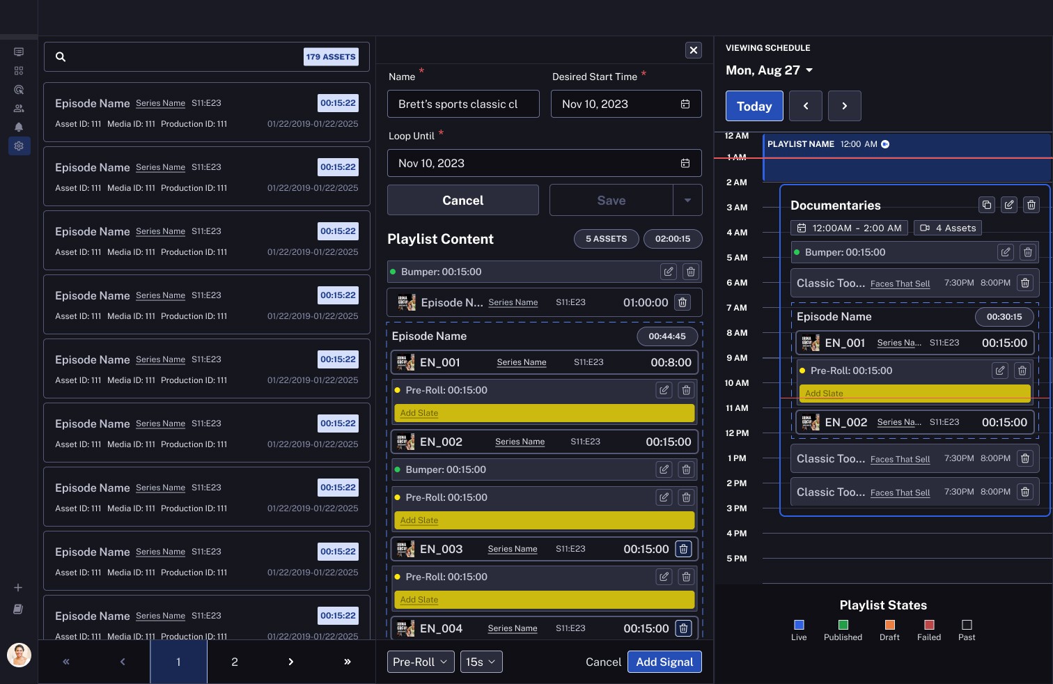
Redefining Time: Calendar vs. Timeline
Schedulers struggled with the original platform’s linear layout, which lacked clarity and context. It was hard to visualize how playlists and time blocks interacted—an essential task for managing schedules efficiently. This raised a critical opportunity: What if we could align the scheduling interface with users' natural mental models of time, reducing cognitive load and increasing confidence?
To address this, I explored two possible solutions:

The Timeline Approach: Borrowing from Video Editing
Inspired by video editing tools like Adobe Premiere and Final Cut, I initially considered a timeline-based interface. Timelines excel at managing linear time, especially for assets like videos, where precise control and layering are crucial. This model seemed promising given that playlists are, at their core, time-based assets. A timeline could allow users to stack, layer, and tweak playlists with the precision editors use when cutting scenes.

However, as I delved deeper, challenges emerged:
Time as Context vs. Content: Timelines treat time as content to be edited, but schedulers needed to see time as a contextual framework. Their focus wasn’t on manipulating assets in isolation but on understanding dependencies and how changes ripple across a schedule.
Task Granularity: Unlike editing videos, where users work with detailed micro-adjustments, scheduling tasks require a broader, higher-level view to identify overlaps, gaps, and conflicts across a day or week.
Scheduler Workflow: Timelines align with creation-focused workflows, but scheduling is more about coordination. The need for drag-and-drop simplicity and immediate feedback on schedule changes made timelines feel overly complex for this use case.
The Calendar Approach: A Natural Fit
This led me to consider a calendar-based model. Calendars are intuitive tools for visualizing time, enabling users to see tasks within a day or week at a glance. They also naturally reflect the flow of a scheduler’s day-to-day responsibilities, prioritizing clarity over complexity. By focusing on this mental model, I identified several key principles for the redesign:

Day View Focus: Scheduling inherently ties to specific days and times. A calendar's day-based view provides an at-a-glance understanding of tasks, avoiding the endless scrolling required in the original linear interface.
Time Blocks as Core Units: By anchoring tasks to adjustable time blocks, we allowed users to drag, resize, and rearrange playlists seamlessly—mirroring how calendars manage events.
Real-Time Feedback: Predictability was a critical user need. A calendar’s ability to reflect schedule changes in real time (e.g., extending a playlist or adding an ad break) gave users confidence in their decisions and reduced the chance of errors.

Ultimately, while a timeline could be ideal for asset creation workflows, a calendar proved to be the better solution for schedulers. What if we could reimagine the interface to give schedulers a sense of clarity, efficiency, and control? By embracing the calendar model, we aligned the tool with their natural mental model, transforming the scheduling experience into one that supported their goals in a clear and straight forward way.
Day View Focus: Scheduling is inherently tied to specific times and days. Unlike the previous linear approach, where users had to scroll endlessly, a day-based view offered a clearer snapshot of tasks within a 24-hour frame. This perspective allowed users to see overlaps, gaps, and priorities more clearly.
Time Blocks as a Core Element: Calendars leverage the concept of time blocks to represent tasks, events, or meetings. Translating this to playlist scheduling, we made time the anchor point for all decisions. Users could now visualize playlists as blocks that could be dragged, resized, and adjusted to fit seamlessly into their schedules.
Immediate Feedback: One critical insight was the need for predictability. Users wanted to see how changes, like extending a playlist or inserting an ad break, would impact the rest of their schedule. The calendar-inspired view provided this context in real-time, reducing errors and increasing confidence in decision-making.
This shift from a linear layout to a calendar view wasn’t just a visual change—it was a fundamental rethinking of how schedulers interact with time and tasks. The redesigned view brought clarity, efficiency, and a sense of control that had been missing in the original design.
Advocating for Visual Clarity with Color
The platform’s dark mode aesthetic initially constrained how color could be used. While visually striking, this design choice made it difficult to differentiate playlist states, leading to confusion and inefficiencies. This presented a compelling opportunity: What if we could enhance visual clarity without compromising the dark mode aesthetic, enabling users to scan schedules faster and with greater confidence?

A Balance of Function and Form
To address this, we introduced a color-coded system to represent playlist states. Each state was assigned a distinct color based on user expectations and mental associations:
Drafts: Yellow, for “work-in-progress” state.
Published: Green, for readiness and completion.
Conflicts: Red, for unresolved issues or critical errors.
Live Content: Blue, for content currently playing in real time.
Past: Black, for playlist that have already played.

This system provided a clear and immediate way for users to understand the status of playlists at a glance. However, integrating color into the dark mode interface wasn’t without challenges. Stakeholders were concerned that vibrant colors might clash with the aesthetic or distract users from the content.
Building the Case: Prototypes and Data-Driven Insights
To convince stakeholders, I created prototypes and conducted A/B testing, comparing the original monochromatic design with the proposed color-coded system. The results spoke for themselves:
Improved Scannability: Test participants completed scanning tasks 25% faster with the color-coded interface, as they no longer needed to rely on text labels alone.
Error Reduction: Users reported fewer errors when identifying playlist states, such as mistaking unpublished drafts for published content—a critical issue in the original design.
Enhanced Confidence: The use of color gave schedulers a clear understanding of their tasks, reducing hesitation and decision-making time.
Measurable Impact: A Real-World Shift
After release, we saw measurable improvements in platform usage:
10% Reduction in Downtime: With quicker identification of gaps and conflicts in the schedule, live content was broadcast more reliably, minimizing disruptions.
Fewer Publishing Mistakes: The color system drastically reduced instances where users mistakenly believed content was live when it was still in draft form.
To further support schedulers, we added a legend at the bottom of the schedule view, reinforcing the meaning of each color. This small but powerful addition ensured that even first-time users could quickly learn the system, eliminating onboarding friction.
This iterative approach to incorporating color wasn’t just about aesthetics—it was about transforming how schedulers interacted with their tools. By combining user feedback, careful testing, and thoughtful design, we delivered a solution that elevated both the platform’s usability and user confidence.
The Solution
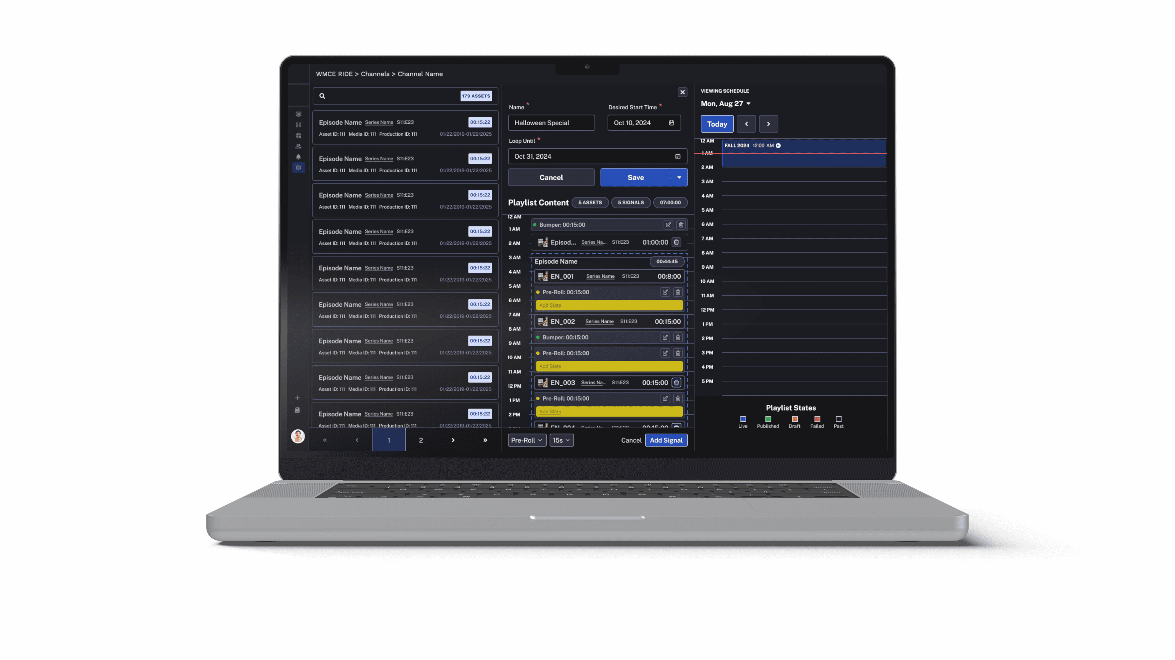
Signals and Slates
We introduced signals and slates as part of the playlist creation and management workflow:
Signals:
Provided real-time visual indicators of playlist status (e.g., draft, published).
Integrated with the timeline view to show dependencies and potential conflicts, offering users immediate feedback on the state of their playlists.
Slates:
Allowed users to define pre-roll and mid-roll ad placements directly within the playlist.
Streamlined the ad scheduling process, eliminating the need for external tools and reducing the risk of errors in ad placement.
Enhanced Scheduling Experience
Calendar-Based Scheduling:
Incorporated a timeline view inspired by calendar interfaces, allowing users to plan and organize playlists with drag-and-drop functionality.
Introduced an "Estimated Playout" indicator, providing instant feedback on how playlists fit within the schedule. This feature enabled users to visualize the flow of playlists over time.
Conflict Resolution Workflow:
Introduced a conflict resolution modal with clear options (e.g., truncate, adjust start date) to handle scheduling conflicts.
Visualized conflicts directly within the timeline, making it easier for users to understand and address issues without switching contexts.
Results
Improved Efficiency
30% Reduction in Scheduling Time: The calendar-based timeline and visual indicators significantly streamlined playlist creation. Users reported fewer errors and faster turnaround times for completing scheduling tasks.
User Adoption
85% Increase in User Satisfaction: Feedback highlighted the platform’s newfound ease of use and clarity. Users appreciated the visual clarity brought by the new design and found the platform more approachable.
Revenue Impact
Enhanced Ad Placement Efficiency: The ability to manage pre-roll and mid-roll ads within the platform improved ad revenue by ensuring consistent and accurate placements. This increased operational efficiency for teams responsible for monetization.
Conclusion
By focusing on playlist management and creation, we transformed a complex workflow into an intuitive experience. The introduction of calendar-inspired scheduling, signals, and slates bridged the gap between user needs and platform capabilities, setting the foundation for continued scalability and user satisfaction.